This is part four of eight tutorials that walk through how to build a simple Digg client application using the Beta1 release of Silverlight 2. These tutorials are intended to be read in-order, and help explain some of the core programming concepts of Silverlight. Bookmark my Silverlight 2 Reference page for more of Silverlight posts and content.
<Download Code> Click here to download a completed version of this Digg client sample. </Download Code>
Using Style Elements to Better Encapsulate Look and Feel
WPF and Silverlight support a Style mechanism that allows us to encapsulate control property values as a reusable resource. We can store these style declarations in separate files from our pages, and re-use them across multiple controls and pages in an application (as well as re-use them across multiple applications). This is conceptually similar to using CSS with HTML when doing basic customization scenarios.
Note: In addition to defining basic property settings (Color, Font, Size, Margins, etc), styles in WPF and Silverlight can also be used to define and re-use Control Templates - which enable super rich skinning and adaptation of control structure (and support customization scenarios not possible with CSS in HTML today). I discuss Control Templates in Part 7 of this series.
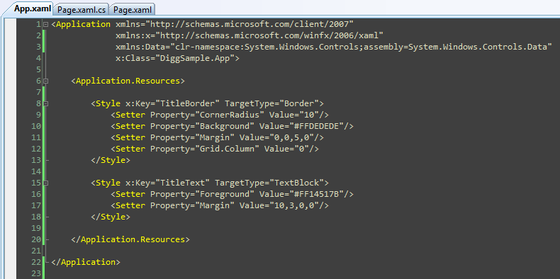
For our Digg sample application we'll define our Style declarations within the App.xaml file of our project. This will enable them to be reused across all pages and controls in the application:

Let's start by encapsulating styles for the <Border> control (and the <TextBlock> title contained within it) of our Digg page:


We can create two Style elements within our App.xaml file that encapsulate the <Border> and <TextBlock> settings we were previously declaring inline using the markup below:

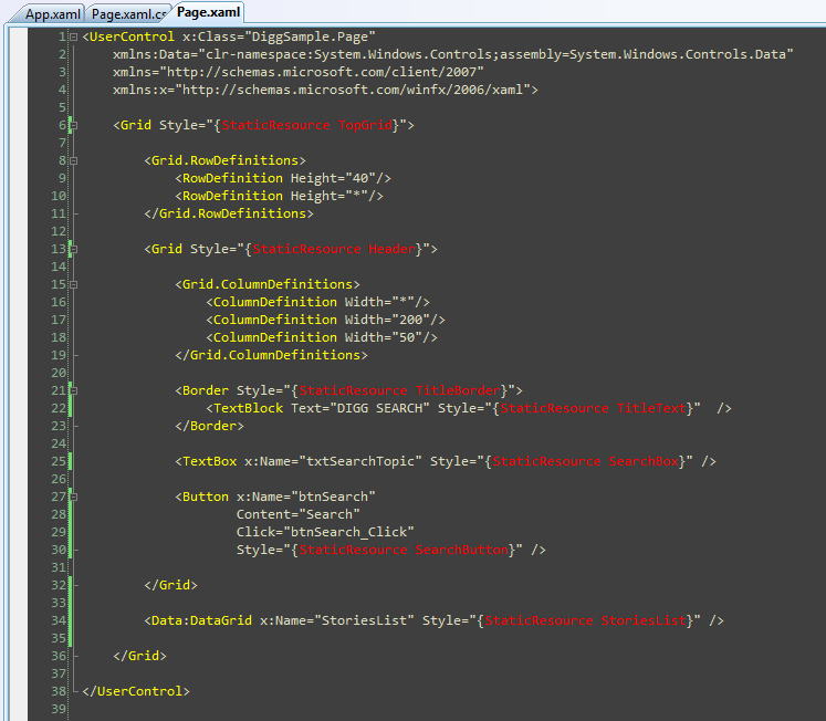
Note how we are giving each Style a unique "Key" value above. We can then update our <Border> and <TextBlock> controls to reference the Styles using these keys. We'll be using a XAML feature called "markup extensions" to do this. Markup extensions are used when there are non-literal values that we want to set (another example of where we'll use this feature is with databinding expressions).

When we update the other controls within our Page.xaml file to use styles as well, we are left with a file that looks like below:

Encapsulate the style settings this way allows developers to better focus on the behavior semantics of the application, and also enables us to re-use styles across other controls/pages we build.
Note: One issue to be aware of with Beta1 is that the error message when you mistype style names and property declarations is not very clear (it raises an exception but doesn't tell you what isn't set correctly). This will be improved in Beta2. In the meantime if you see an error loading a style make sure to look carefully for typos.
Next Steps
Now that we've cleaned up the markup of our Page.xaml file using Style references, let's go one step further and customize the appearance of our Story data more.
To-do that let's jump to our next tutorial: Using the ListBox and Databinding to Display List Data.


相关推荐
4. **数据模板(DataTemplates_Tutorial_07_CS.pdf)**:探讨了如何使用数据模板来动态呈现数据,使数据可视化更加灵活和多样化,适应不同类型的数据显示需求。 5. **SQL数据库连接(SQLDB_Tutorial_03_CS.pdf)**...
C#开发WPF/Silverlight动画及游戏系列教程(Game Tutorial) 的源代码 第一部分源码:WPFGameTutorial_PartI.rar(1-20节) 第二部分源码:WPFGameTutorial_PartII.rar (21-26节) 第三部分源码:WPFGameTutorial_Part...
有关DSP学习的英语教程,共为四部分。
有关DSP学习的英语教程,共为四部分。
C#开发WPF/Silverlight动画及游戏系列教程(Game Tutorial)目录 本系列教程目录如下: C#开发WPF/Silverlight动画及游戏系列教程(Game Tutorial):(一)让物体动起来① C#开发WPF/Silverlight动画及游戏系列教程...
有关DSP学习的英语教程,共为四部分。
有关DSP学习的英语教程,共为四部分。
C#开发WPF/Silverlight动画及游戏系列教程(Game Tutorial) 的源代码 第一部分源码:WPFGameTutorial_PartI.rar(1-20节) 第二部分源码:WPFGameTutorial_PartII.rar (21-26节) 第三部分源码:WPFGameTutorial_Part...
ANSYS FLUENT14.0 Tutorial Guide 自带算例 part3
ANSYS FLUENT14.0 Tutorial Guide自带算例文件 part2
C#开发WPF/Silverlight动画及游戏系列教程(Game Tutorial) 的源代码 第一部分源码:WPFGameTutorial_PartI.rar(1-20节) 第二部分源码:WPFGameTutorial_PartII.rar (21-26节) 第三部分源码:WPFGameTutorial_Part...
C#开发WPF/Silverlight动画及游戏系列教程(Game Tutorial) 的源代码 第一部分源码:WPFGameTutorial_PartI.rar(1-20节) 第二部分源码:WPFGameTutorial_PartII.rar (21-26节) 第三部分源码:WPFGameTutorial_Part...
反汇编入门教程,绝对精品,共四十集,分七个压缩卷。 工具软件:OllyDBG A reversing tutorial for newbies by lena151
反汇编入门教程,绝对精品,共四十集,分七个压缩卷。 工具软件:OllyDBG A reversing tutorial for newbies by lena151
反汇编入门教程,绝对精品,共四十集,分七个压缩卷。 工具软件:OllyDBG A reversing tutorial for newbies by lena151
反汇编入门教程,绝对精品,共四十集,分七个压缩卷。 工具软件:OllyDBG A reversing tutorial for newbies by lena151
反汇编入门教程,绝对精品,共四十集,分七个压缩卷。 工具软件:OllyDBG A reversing tutorial for newbies by lena151
反汇编入门教程,绝对精品,共四十集,分七个压缩卷。 工具软件:OllyDBG A reversing tutorial for newbies by lena151
反汇编入门教程,绝对精品,共四十集,分七个压缩卷。 工具软件:OllyDBG A reversing tutorial for newbies by lena151
OpenGL ES Tutorial for Android – Part I – Setting up the view OpenGL ES Tutorial for Android – Part II – Building a polygon OpenGL ES Tutorial for Android – Part III – Transformations OpenGL ES ...