Background
Tables and trees are powerful tools for presenting data in a structured manner. Data is displayed as a collection of items which have attributes like text(s), image(s), and sometimes interactive controls such as checkboxes. Typically, clients create the items and set their attributes, after which the table or tree takes responsibility for displaying them. This approach makes item creation straightforward and visually consistent, but is inflexible. For example, an item in a table or tree can only contain one image, and it must appear before its text. Given the range of visual appearances that a client may want an item to have, the best way to ensure that clients can create items with custom appearances is to allow items to be drawn.
The ability to partially or fully custom draw TableItems and TreeItems has been added as of Eclipse 3.2, and will be described in this article. It should be noted that all references made throughout the article to tables can be equally applied to trees, and vice versa.
Custom Draw Events
Custom drawing is done on a per-cell basis, where a cell is the portion of an item that resides within some row and column of the parent table, or the full item if the table has no columns. For example, if a table has two columns and three items then it has six cells.
The following Table events have been defined to provide hooks into the drawing process:
-
SWT.MeasureItem: allows a client to specify the dimensions of a cell's content
-
SWT.EraseItem: allows a client to custom draw a cell's background and/or selection, and to influence whether the cell's foreground should be drawn
-
SWT.PaintItem: allows a client to custom draw or augment a cell's foreground and/or focus rectangle
To minimize the amount of work required to draw cells, these events are configured to reflect how the cell would be drawn by default. This makes it easy to augment a cell's default appearance without having to draw the whole cell. If a client does not hook one of these listeners then the default cell drawing process will occur. The following sections will examine each of these events in detail along with some example code snippets.
SWT.MeasureItem
SWT.MeasureItem is the first custom draw event that is sent. This event gives a client the opportunity to specify the width and/or height of a cell's content. It is important to note that content size is not necessarily equivalent to cell size, since the latter may include additional decorations such as checkboxes or tree indentation. Contexts where this event is typically sent include drawing a cell and packing a table column. This event comes pre-configured with the following fields:
-
item: the item
-
index: the column index of item to be measured
-
width: the default content width that the table would use if it were to draw the cell itself, based on its text, image, and checkbox
-
height: the default content height that the table would use, based on the height of all of its items
-
gc: a GC that is configured with the cell's font, which can be useful for performing string measurements
An application that wishes to specify a different content width and/or height for the cell can do so by changing the event's width andheight fields. A listener may choose to not change one or both of these values.
Example 1: Specifying cell widths and heights
Listing 1 (snippet) demonstrates the use of SWT.MeasureItem to specify custom content dimensions in a table with no columns.
| 1 |
Display display = new Display(); |
| 2 |
Shell shell = new Shell(display); |
| 3 |
shell.setBounds(10,10,200,250); |
| 4 |
final Table table = new Table(shell, SWT.NONE); |
| 5 |
table.setBounds(10,10,150,200); |
| 6 |
table.setLinesVisible(true); |
| 7 |
for (int i = 0; i < 5; i++) { |
| 8 |
new TableItem(table, SWT.NONE).setText("item " + i); |
| 9 |
} |
| 10 |
table.addListener(SWT.MeasureItem, new Listener() { |
| 11 |
public void handleEvent(Event event) { |
| 12 |
int clientWidth = table.getClientArea().width; |
| 13 |
event.height = event.gc.getFontMetrics().getHeight() * 2; |
| 14 |
event.width = clientWidth * 2; |
| 15 |
} |
| 16 |
}); |
| 17 |
shell.open(); |
| 18 |
while (!shell.isDisposed()) { |
| 19 |
if (!display.readAndDispatch()) display.sleep(); |
| 20 |
} |
| 21 |
display.dispose(); |
Listing 1. Specifying custom widths and heights for items in a table with no columns
Lines 1-3:
Creates a display and shell, and sets the shell's bounds.
Lines 4-6:
Creates the table with no columns, sets its bounds, and sets its lines to be visible.
Lines 7-9:
Creates the table's items.
Lines 10-11
Adds an SWT.MeasureItem listener to the table, which will be invoked whenever the size of a cell's content is needed.
Line 12:
Gets the table's client width, which will be used when specifying the cell's content width.
Line 13:
Sets the event's height field to double the height of the font. This effectively doubles the height of the item in the event's itemfield relative to its default height.
Line 14:
Sets the event's width field to double the width of the table. This specifies that the width of the cell should be this value regardless of its content. Note that since this table has no columns, the width of the cell is equivalent to that of the full item.
Lines 17 to 21:
Opens the shell, runs the event loop until the shell has been disposed, and disposes the display just before exiting.
Figure 1 shows a screenshot of the snippet in Listing 1 running. Note the increased item heights (caused by line 13), and increased item widths (caused by line 14) which can be inferred from the table's horizontal scrollbar. Figure 2 shows a screenshot of the same snippet running with lines 10 through 16 commented out, allowing the table to draw in its default manner.
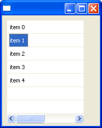
Figure 1. Screenshot of Listing 1 running, which specifies custom widths and heights for the items in a table
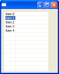
Figure 2. Screenshot of Listing 1 running without the SWT.MeasureItem listener
Note that attempts to change a cell's width or height in SWT.MeasureItem events are subject to the following constraints:
- As of Eclipse 3.2 cell heights are not allowed to shrink, only to grow.
- All items in a table have the same height, so increasing the height of a cell will result in the height of all items in the table growing accordingly.
- If the cell is within a table column then its width is determined by the column's width. However, the
SWT.MeasureItem event's width field should still always be set to the cell's desired content width because this value will be used if the table has no columns or if its column is being packed.
Example 2: Packing columns
Listing 2 (snippet) demonstrates the use of SWT.MeasureItem to specify cell widths when a table column is packed.
| 1 |
Display display = new Display(); |
| 2 |
Shell shell = new Shell(display); |
| 3 |
shell.setBounds(10,10,400,200); |
| 4 |
Table table = new Table(shell, SWT.NONE); |
| 5 |
table.setBounds(10,10,350,150); |
| 6 |
table.setHeaderVisible(true); |
| 7 |
table.setLinesVisible(true); |
| 8 |
final TableColumn column0 = new TableColumn(table, SWT.NONE); |
| 9 |
column0.setWidth(100); |
| 10 |
final TableColumn column1 = new TableColumn(table, SWT.NONE); |
| 11 |
column1.setWidth(100); |
| 12 |
column0.addListener(SWT.Selection, new Listener() { |
| 13 |
public void handleEvent(Event event) { |
| 14 |
column0.pack(); |
| 15 |
} |
| 16 |
}); |
| 17 |
column1.addListener(SWT.Selection, new Listener() { |
| 18 |
public void handleEvent(Event event) { |
| 19 |
column1.pack(); |
| 20 |
} |
| 21 |
}); |
| 22 |
for (int i = 0; i < 5; i++) { |
| 23 |
TableItem item = new TableItem(table, SWT.NONE); |
| 24 |
item.setText(0, "item " + i + " col 0"); |
| 25 |
item.setText(1, "item " + i + " col 1"); |
| 26 |
} |
| 27 |
table.addListener(SWT.MeasureItem, new Listener() { |
| 28 |
public void handleEvent(Event event) { |
| 29 |
event.width *= 2; |
| 30 |
} |
| 31 |
}); |
| 32 |
shell.open(); |
| 33 |
while (!shell.isDisposed()) { |
| 34 |
if (!display.readAndDispatch()) display.sleep(); |
| 35 |
} |
| 36 |
display.dispose(); |
Listing 2. Specifying custom cell content widths that are used by TableColumn.pack() to size a column
Lines 1-3:
Creates a display and shell, and sets the shell's bounds.
Lines 4-7:
Creates the table, sets its bounds, and sets its header and lines to be visible.
Lines 8-11:
Creates two table columns and sets the initial width of each to 100 pixels.
Lines 12-21:
Adds an SWT.Selection listener to each of the table's columns. These listeners will invoke pack() on the column whenever its header is clicked by the user.
Lines 22-26:
Creates the table's items.
Lines 27-28:
Adds an SWT.MeasureItem listener to the table, which will be invoked whenever the size of a cell's content is needed.
Line 29:
Sets the event's width field to double the default width of the cell. This specifies that the width of the cell should be this value regardless of its content.
Lines 32-36:
Opens the shell, runs the event loop until the shell has been disposed, and disposes the display just before exiting.
Figure 3 shows a screenshot of the snippet in Listing 2 running after each of the table's columns have been packed by clicking on their headers. Note that the columns have been packed to a width that is double of what is needed as a result of the SWT.MeasureItem listener in line 29. Figure 4 shows a screenshot of the same snippet running with lines 27 through 31 commented out, which leaves the table's columns to pack to their default widths.
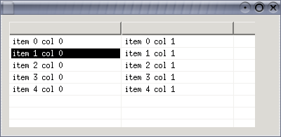
Figure 3. Screenshot of Listing 2 running after the table's columns have been packed using the cell content sizes specified in theSWT.MeasureItem listener
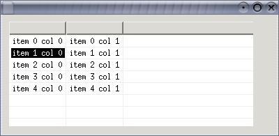
Figure 4. Screenshot of Listing 2 running after the table's columns have been packed using the default cell sizes
SWT.EraseItem
SWT.EraseItem is sent just before the background of a cell is about to be drawn. The background consists of the cell's background color or the selection background if the item is selected. This event allows a client to custom draw one or both of these. Also, this event allows the client to indicate whether the cell's default foreground should be drawn following the drawing of the background.
When this event is received the cell has been filled with either the table's background color or the portion of its background image that intersects with the cell. This event comes pre-configured with the following fields:
-
item: the item
-
index: the column index of item being drawn
-
x, y: the table-relative co-ordinates of the top-left corner of the cell
-
width, height: the width and height of the full cell, or the content width of the cell if the table has no columns; if these values were previously set by an SWT.MeasureItem listener then they are the same here
-
gc: the GC configured with the default foreground, background, font and clipping for the cell
-
detail: the logical OR of one or more of the following bits, indicating what will be drawn by default:
-
SWT.FOREGROUND: this bit will be set if the default cell foreground will be drawn once the background has been drawn (default is true)
-
SWT.BACKGROUND: this bit will be set if either a cell-specific or item-specific background color will be drawn for this cell (ie.- a color has previously been set with either TableItem.setBackground(Color) or TableItem.setBackground(int, Color))
-
SWT.SELECTED: this bit will be set if the selection will be drawn for this cell, implying that this item is selected
-
SWT.FOCUSED: this bit will be set if the focus rectangle will be drawn for this cell, implying that this item is the focus item in the table
-
SWT.HOT: (@since 3.3) this bit will be set if the mouse hover background will be drawn for this cell (not all platforms draw this)
-
doit: this boolean indicates whether the table will do the drawing specified in the detail field once this listener has completed (default is true)
The listener is responsible for modifying the event to specify the elements that will be custom drawn (if any), and then doing the work. This is done by clearing certain bits in the detail field, or by setting the doit field to false to indicate that the listener will do all drawing for the cell (usually in combination with an SWT.PaintItem listener).
Example 3: Custom drawing item selection
Listing 3 (snippet) demonstrates the use of SWT.EraseItem to custom draw the item selection rectangle in a table.
| 1 |
Display display = new Display(); |
| 2 |
Shell shell = new Shell(display); |
| 3 |
final Color red = display.getSystemColor(SWT.COLOR_RED); |
| 4 |
final Color yellow = display.getSystemColor(SWT.COLOR_YELLOW); |
| 5 |
final Table table = new Table(shell, SWT.FULL_SELECTION); |
| 6 |
table.setHeaderVisible(true); |
| 7 |
new TableColumn(table, SWT.NONE).setWidth(100); |
| 8 |
new TableColumn(table, SWT.NONE).setWidth(100); |
| 9 |
new TableColumn(table, SWT.NONE).setWidth(100); |
| 10 |
for (int i = 0; i < 5; i++) { |
| 11 |
TableItem item = new TableItem(table, SWT.NONE); |
| 12 |
item.setText(0, "item " + i + " col 0"); |
| 13 |
item.setText(1, "item " + i + " col 1"); |
| 14 |
item.setText(2, "item " + i + " col 2"); |
| 15 |
} |
| 16 |
table.pack(); |
| 17 |
table.addListener(SWT.EraseItem, new Listener() { |
| 18 |
public void handleEvent(Event event) { |
| 19 |
event.detail &= ~SWT.HOT; |
| 20 |
if ((event.detail & SWT.SELECTED) == 0) return; /* item not selected */ |
| 21 |
int clientWidth = table.getClientArea().width; |
| 22 |
GC gc = event.gc; |
| 23 |
Color oldForeground = gc.getForeground(); |
| 24 |
Color oldBackground = gc.getBackground(); |
| 25 |
gc.setForeground(red); |
| 26 |
gc.setBackground(yellow); |
| 27 |
gc.fillGradientRectangle(0, event.y, clientWidth, event.height, false); |
| 28 |
gc.setForeground(oldForeground); |
| 29 |
gc.setBackground(oldBackground); |
| 30 |
event.detail &= ~SWT.SELECTED; |
| 31 |
} |
| 32 |
}); |
| 33 |
shell.pack(); |
| 34 |
shell.open(); |
| 35 |
while (!shell.isDisposed()) { |
| 36 |
if (!display.readAndDispatch()) display.sleep(); |
| 37 |
} |
| 38 |
display.dispose(); |
Listing 3: Custom drawing item selection
Lines 1-2:
Creates a display and shell.
Lines 3-4:
Obtains the system's red and yellow colors, which will be used for drawing the custom selection.
Lines 5-6:
Creates the table and sets its header to be visible. The table's style is specified to be SWT.FULL_SELECTION since the custom-drawn selection will span the full table width.
Lines 7-9:
Creates three table columns and sets the initial width of each to 100 pixels.
Lines 10-15:
Creates the table's items.
Line 16:
Packs the table to its preferred size.
Lines 17-18:
Adds an SWT.EraseItem listener to the table, which will be invoked whenever the background of a cell is about to be drawn.
Line 19:
Clears the SWT.HOT bit from the event's detail field to ensure that hover backgrounds are not natively drawn.
Line 20:
Checks the detail field for the SWT.SELECTED bit, and returns out of the listener if it is not there since there is no selection to draw.
Line 21:
Gets the table's client width, to be used for drawing the cell's selection.
Lines 22-24:
Obtains the GC to draw on from the event and stores its foreground and background colors for the purpose of restoring them later.
Lines 25-27:
Draws the custom selection rectangle using a gradient that spans from red to yellow. Line 26 specifies the full width of the item as the gradient bounds so that the color range will span the table width properly. Since the GC's clipping is pre-configured to the bounds of the cell, only this portion of this gradient drawing will appear.
Lines 28-29:
Restores the GC's foreground and background colors to their previous values.
Line 30:
Clears the SWT.SELECTED bit from the event's detail field to indicate that the default selection should not be drawn for this cell. Note that this item is still considered to be logically selected in the table.
Lines 33-38:
Packs and opens the shell, runs the event loop until the shell has been disposed, and disposes the display just before exiting.
Figure 5 shows a screenshot of the snippet in Listing 3 running. Though the selection gradient appears to be one continuous rectangle, it is actually drawn three times, each clipped to its respective cell.
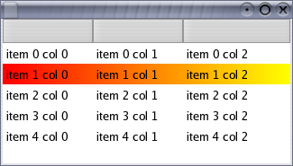
Figure 5. Screenshot of Listing 3 running, which uses an SWT.EraseItem listener to draw a custom selection
Example 4: Custom drawing cell backgrounds
Listing 4 (snippet) demonstrates the use of SWT.EraseItem to custom draw cell backgrounds in a table with no columns. This example modifies the default clipping of the GC to display gradient rectangles that represent temperature ranges.
| 1 |
final String[] MONTHS = { |
| 2 |
"Jan", "Feb", "Mar", "Apr", "May", "Jun", |
| 3 |
"Jul", "Aug", "Sep", "Oct", "Nov", "Dec" |
| 4 |
} |
| 5 |
final int[] HIGHS = {-7, -4, 1, 11, 18, 24, 26, 25, 20, 13, 5, -4}; |
| 6 |
final int[] LOWS = {-15, -13, -7, 1, 7, 13, 15, 14, 10, 4, -2, -11}; |
| 7 |
final int SCALE_MIN = -30; final int SCALE_MAX = 30; |
| 8 |
final int SCALE_RANGE = Math.abs(SCALE_MIN - SCALE_MAX); |
| 9 |
Display display = new Display(); |
| 10 |
Shell shell = new Shell(display); |
| 11 |
shell.setBounds(10,10,400,350); |
| 12 |
shell.setText("Ottawa Average Daily Temperature Ranges"); |
| 13 |
final Color blue = display.getSystemColor(SWT.COLOR_BLUE); |
| 14 |
final Color white = display.getSystemColor(SWT.COLOR_WHITE); |
| 15 |
final Color red = display.getSystemColor(SWT.COLOR_RED); |
| 16 |
final Image parliamentImage = new Image(display, "./parliament.jpg"); |
| 17 |
final Table table = new Table(shell, SWT.NONE); |
| 18 |
table.setBounds(10,10,350,300); |
| 19 |
table.setBackgroundImage(parliamentImage); |
| 20 |
for (int i = 0; i < 12; i++) { |
| 21 |
TableItem item = new TableItem(table, SWT.NONE); |
| 22 |
item.setText(MONTHS[i] + " (" + LOWS[i] + "C..." + HIGHS[i] + "C)"); |
| 23 |
} |
| 24 |
final int clientWidth = table.getClientArea().width; |
| 25 |
table.addListener(SWT.MeasureItem, new Listener() { |
| 26 |
public void handleEvent(Event event) { |
| 27 |
int itemIndex = table.indexOf((TableItem)event.item); |
| 28 |
int rightX = (HIGHS[itemIndex] - SCALE_MIN) * clientWidth / SCALE_RANGE; |
| 29 |
event.width = rightX; |
| 30 |
} |
| 31 |
}); |
| 32 |
table.addListener(SWT.EraseItem, new Listener() { |
| 33 |
public void handleEvent(Event event) { |
| 34 |
int itemIndex = table.indexOf((TableItem)event.item); |
| 35 |
int leftX = (LOWS[itemIndex] - SCALE_MIN) * clientWidth / SCALE_RANGE; |
| 36 |
int rightX = (HIGHS[itemIndex] - SCALE_MIN) * clientWidth / SCALE_RANGE; |
| 37 |
GC gc = event.gc; |
| 38 |
Rectangle clipping = gc.getClipping(); |
| 39 |
clipping.x = leftX; |
| 40 |
clipping.width = rightX - leftX; |
| 41 |
gc.setClipping(clipping); |
| 42 |
Color oldForeground = gc.getForeground(); |
| 43 |
Color oldBackground = gc.getBackground(); |
| 44 |
gc.setForeground(blue); |
| 45 |
gc.setBackground(white); |
| 46 |
      gc.fillGradientRectangle(
event.x, event.y, event.width / 2, event.height, false); |
| 47 |
gc.setForeground(white); |
| 48 |
gc.setBackground(red); |
| 49 |
      gc.fillGradientRectangle(
event.x + event.width / 2, event.y, event.width / 2, event.height, false); |
| 50 |
gc.setForeground(oldForeground); |
| 51 |
gc.setBackground(oldBackground); |
| 52 |
event.detail &= ~SWT.BACKGROUND; |
| 53 |
event.detail &= ~SWT.HOT; |
| 54 |
} |
| 55 |
}); |
| 56 |
shell.open(); |
| 57 |
while (!shell.isDisposed()) { |
| 58 |
if (!display.readAndDispatch()) display.sleep(); |
| 59 |
} |
| 60 |
parliamentImage.dispose(); |
| 61 |
display.dispose(); |
Listing 4. Custom drawing item backgrounds
Lines 1-8:
Defines constants that will be used to set the table's item data and to draw item backgrounds.
Lines 9-12:
Creates a display and shell, and sets the shell's bounds and title.
Lines 13-15:
Obtains the system's blue, white and red colors, which will be used for drawing item backgrounds.
Line 16:
Loads an image that will be set into the table as the background.
Lines 17-18:
Creates the table with no columns and sets its bounds.
Line 19:
Sets the background image into the table.
Lines 20-23:
Creates the table's items.
Line 24:
Stores the table's client width for later use when drawing the item backgrounds.
Lines 25-26:
Adds an SWT.MeasureItem listener to the table so that item sizes can be specified.
Lines 27-29:
Computes the right bound of the item in the event's item field and sets this value into the event's width field.
Lines 32-33:
Adds an SWT.EraseItem listener to the table so that item backgrounds can be custom drawn.
Lines 34-36:
Gets the item from the event's item field and computes the left and right bounds that its temperature bar should be drawn with.
Lines 37-41:
Updates the clipping of the GC in the event's gc field to the bounds that were computed for this item's temperature bar.
Lines 42-43:
Stores the GC's foreground and background colors for the purpose of restoring them later.
Lines 44-46:
Draws the left half of the custom background rectangle with a gradient that spans from blue to white. The portion of this rectangle that intersects with the GC's clipping bounds that were set in line 41 will ultimately appear.
Lines 47-49:
Draws the right half of the custom background rectangle with a gradient that spans from white to red. The portion of this rectangle that intersects with the GC's clipping bounds that were set in line 41 will ultimately appear.
Lines 50-51:
Restores the GC's foreground and background colors to their previous values.
Line 52:
Clears the SWT.BACKGROUND bit from the event's detail field to indicate that the default background should not be drawn for this cell.
Line 53:
Clears the SWT.HOT bit from the event's detail field to ensure that hover backgrounds are not natively drawn.
Lines 56-61:
Opens the shell, runs the event loop until the shell has been disposed, and disposes the background image and display just before exiting.
Figure 6 shows a screenshot of the snippet in listing 4 running.

Figure 6. Screenshot of Listing 4 running, which uses an SWT.EraseItem listener to draw custom item backgrounds
SWT.PaintItem
SWT.PaintItem is sent for a cell just after its default foreground contents have been drawn. This event allows a client to augment the cell, or to completely draw the cell's content. This event always comes pre-configured with the following fields:
-
item: the item
-
index: the column index of item being drawn
-
x, y: the table-relative co-ordinates of the top-left corner of the cell's content (ie.- its image or text)
-
width, height: the width and height of the cell's content; if these values were previously set by an SWT.MeasureItem listener then they are the same here
-
gc: the GC configured with the default foreground, background, font and clipping for the cell
-
detail: the logical OR of zero or more of the following bits:
-
SWT.SELECTED: this bit will be set if the item is selected
-
SWT.FOCUSED: this bit will be set if the item is the table's focus item
-
SWT.HOT: (@since 3.3) this bit will be set if the mouse hover background will be drawn for this cell (not all platforms draw this)
The purpose of the x and y fields are to indicate the location for custom drawing. These values take into account decorations such as checkboxes and tree indentation.
Example 5: Enhancing the native content
Listing 5 (snippet) demonstrates the use of SWT.PaintItem to augment the default drawing of tree items. It uses the x, y and widthfields in the SWT.PaintItem event to draw an image to the right of alternating items. This is an example of a simple drawing enhancement that enriches an item's default content while still maintaining its native appearance.
| 1 |
Display display = new Display(); |
| 2 |
Shell shell = new Shell(display); |
| 3 |
shell.setBounds(10, 10, 350, 200); |
| 4 |
Image xImage = new Image (display, 16, 16); |
| 5 |
GC gc = new GC(xImage); |
| 6 |
gc.setForeground(display.getSystemColor(SWT.COLOR_RED)); |
| 7 |
gc.drawLine(1, 1, 14, 14); |
| 8 |
gc.drawLine(1, 14, 14, 1); |
| 9 |
gc.drawOval(2, 2, 11, 11); |
| 10 |
gc.dispose(); |
| 11 |
final int IMAGE_MARGIN = 2; |
| 12 |
final Tree tree = new Tree(shell, SWT.CHECK); |
| 13 |
tree.setBounds(10, 10, 300, 150); |
| 14 |
TreeItem item = new TreeItem(tree, SWT.NONE); |
| 15 |
item.setText("root item"); |
| 16 |
for (int i = 0; i < 4; i++) { |
| 17 |
TreeItem newItem = new TreeItem(item, SWT.NONE); |
| 18 |
newItem.setText("descendent " + i); |
| 19 |
if (i % 2 == 0) newItem.setData(xImage); |
| 20 |
item.setExpanded(true); |
| 21 |
item = newItem; |
| 22 |
} |
| 23 |
tree.addListener(SWT.MeasureItem, new Listener() { |
| 24 |
public void handleEvent(Event event) { |
| 25 |
TreeItem item = (TreeItem)event.item; |
| 26 |
Image trailingImage = (Image)item.getData(); |
| 27 |
if (trailingImage != null) { |
| 28 |
event.width += trailingImage.getBounds().width + IMAGE_MARGIN; |
| 29 |
} |
| 30 |
} |
| 31 |
}); |
| 32 |
tree.addListener(SWT.PaintItem, new Listener() { |
| 33 |
public void handleEvent(Event event) { |
| 34 |
TreeItem item = (TreeItem)event.item; |
| 35 |
Image trailingImage = (Image)item.getData(); |
| 36 |
if (trailingImage != null) { |
| 37 |
int x = event.x + event.width + IMAGE_MARGIN; |
| 38 |
int itemHeight = tree.getItemHeight(); |
| 39 |
int imageHeight = trailingImage.getBounds().height; |
| 40 |
int y = event.y + (itemHeight - imageHeight) / 2; |
| 41 |
event.gc.drawImage(trailingImage, x, y); |
| 42 |
} |
| 43 |
} |
| 44 |
}); |
| 45 |
shell.open(); |
| 46 |
while (!shell.isDisposed()) { |
| 47 |
if (!display.readAndDispatch()) display.sleep(); |
| 48 |
} |
| 49 |
xImage.dispose(); |
| 50 |
display.dispose(); |
Listing 5. Using SWT.PaintItem to augment the default drawing of items
Lines 1-3:
Creates a display and shell, and sets the shell's bounds.
Lines 4-11:
Creates the image that will be used in this example, and defines a constant that will be used when drawing item foregrounds.
Lines 12-13:
Creates the tree with no columns and sets its bounds.
Lines 14-22:
Creates the tree's items. Note that line 19 sets the trailing image as the item data for alternating items. This data will be used when custom drawing the item foregrounds.
Lines 23-24:
Adds an SWT.MeasureItem listener to the tree so that item sizes can be specified.
Lines 25-29:
Gets the item from the event's item field, and if it has a trailing image, updates the event's width field to include space for the item's default content plus the trailing image.
Lines 32-33:
Adds an SWT.PaintItem listener to the tree so that the default foreground can be augmented.
Lines 34-42:
Gets the tree item from the event's item field, and if it has a trailing image set, draws the image to the right of the item's text. The event's x, y and width fields are used to compute the position of the image.
Lines 45-50:
Opens the shell, runs the event loop until the shell has been disposed, and disposes the images and display just before exiting.
Figure 7 shows a screenshot of the snippet in listing 5 running. It has the appearance of a native tree but also includes trailing images.
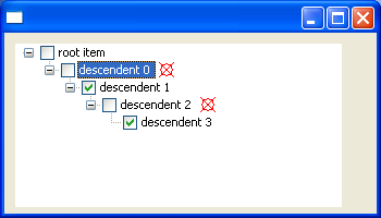
Figure 7. Screenshot of Listing 5 running, which uses an SWT.PaintItem listener to augment the default drawing of items in a tree
Example 6: Custom drawing complete item contents
Listing 6 (snippet) demonstrates the use of SWT.PaintItem to draw items with multiple lines of text, which is not currently supported in tables. It clears the SWT.FOREGROUND bit from the detail field in the SWT.EraseItem event, and then draws the text in theSWT.PaintItem event.
| 1 |
final int COLUMN_COUNT = 4; |
| 2 |
final int ITEM_COUNT = 8; |
| 3 |
final int TEXT_MARGIN = 3; |
| 4 |
Display display = new Display(); |
| 5 |
Shell shell = new Shell(display); |
| 6 |
final Table table = new Table(shell, SWT.FULL_SELECTION); |
| 7 |
table.setHeaderVisible(true); |
| 8 |
table.setLinesVisible(true); |
| 9 |
for (int i = 0; i < COLUMN_COUNT; i++) { |
| 10 |
new TableColumn(table, SWT.NONE); |
| 11 |
} |
| 12 |
for (int i = 0; i < ITEM_COUNT; i++) { |
| 13 |
TableItem item = new TableItem(table, SWT.NONE); |
| 14 |
for (int j = 0; j < COLUMN_COUNT; j++) { |
| 15 |
String string = "item " + i + " col " + j; |
| 16 |
if ((i + j) % 3 == 1) { |
| 17 |
string +="\nnew line1"; |
| 18 |
} |
| 19 |
if ((i + j) % 3 == 2) { |
| 20 |
string +="\nnew line1\nnew line2"; |
| 21 |
} |
| 22 |
item.setText(j, string); |
| 23 |
} |
| 24 |
} |
| 25 |
table.addListener(SWT.MeasureItem, new Listener() { |
| 26 |
public void handleEvent(Event event) { |
| 27 |
TableItem item = (TableItem)event.item; |
| 28 |
String text = item.getText(event.index); |
| 29 |
Point size = event.gc.textExtent(text); |
| 30 |
event.width = size.x + 2 * TEXT_MARGIN; |
| 31 |
event.height = Math.max(event.height, size.y + TEXT_MARGIN); |
| 32 |
} |
| 33 |
}); |
| 34 |
table.addListener(SWT.EraseItem, new Listener() { |
| 35 |
public void handleEvent(Event event) { |
| 36 |
event.detail &= ~SWT.FOREGROUND; |
| 37 |
} |
| 38 |
}); |
| 39 |
table.addListener(SWT.PaintItem, new Listener() { |
| 40 |
public void handleEvent(Event event) { |
| 41 |
TableItem item = (TableItem)event.item; |
| 42 |
String text = item.getText(event.index); |
| 43 |
/* center column 1 vertically */ |
| 44 |
int yOffset = 0; |
| 45 |
if (event.index == 1) { |
| 46 |
Point size = event.gc.textExtent(text); |
| 47 |
yOffset = Math.max(0, (event.height - size.y) / 2); |
| 48 |
} |
| 49 |
event.gc.drawText(text, event.x + TEXT_MARGIN, event.y + yOffset, true); |
| 50 |
} |
| 51 |
}); |
| 52 |
for (int i = 0; i < COLUMN_COUNT; i++) { |
| 53 |
table.getColumn(i).pack(); |
| 54 |
} |
| 55 |
table.pack(); |
| 56 |
shell.pack(); |
| 57 |
shell.open(); |
| 58 |
while (!shell.isDisposed()) { |
| 59 |
if (!display.readAndDispatch()) display.sleep(); |
| 60 |
} |
| 61 |
display.dispose(); |
Listing 6. Using SWT.PaintItem to draw items with multiple lines of text
Lines 1-3:
Defines constants that will be used for creating and drawing the table's items.
Lines 4-5:
Creates a display and shell.
Lines 6-8:
Creates the table and sets its header and lines to be visible.
Lines 9-11:
Creates the table's columns.
Lines 12-24:
Creates the table's items. Item texts are set to values with one, two, or three lines of text.
Lines 25-26:
Adds an SWT.MeasureItem listener to the table so that item sizes can be specified.
Lines 27-31:
Gets the item and column index from the event, computes the bounds of its text, and uses this value to set the event's width and heightfields. TEXT_MARGIN is added to the bounds to create space for a small margin around the item's content.
Lines 34-38:
Adds an SWT.EraseItem listener to the table for the purpose of clearing the SWT.FOREGROUND bit from the event's detail field. This indicates that the default drawing of item foregrounds should not occur because the SWT.PaintItem listener will do this in full.
Lines 39-40:
Adds an SWT.PaintItem listener to the table so that item foregrounds can be custom drawn.
Lines 41-49:
Gets the text for the cell and draws it. The text is centered vertically within the cell for column 1, and draws top-aligned otherwise.
Lines 52-54:
Packs the table's columns to their preferred widths, using the values provided by the SWT.MeasureItem listener.
Lines 55-56:
Packs the table and shell to their preferred sizes.
Lines 57-61:
Opens the shell, runs the event loop until the shell has been disposed, and disposes the display just before exiting.
Figure 8 shows a screenshot of the snippet in Listing 6 running.
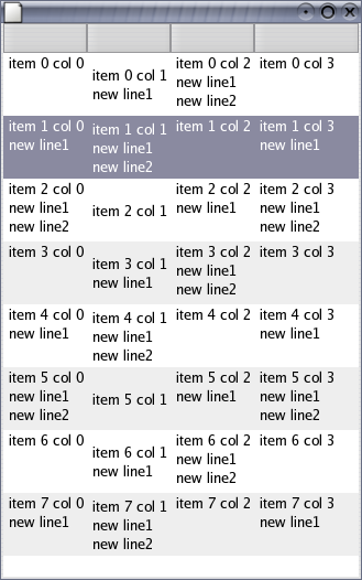
Figure 8. Screenshot of Listing 6 running, which uses an SWT.PaintItem listener to custom draw the table's items


相关推荐
在Qt库中,`QGraphicsScene`和`QGraphicsItem`是用于图形用户界面(GUI)开发的强大工具,尤其适用于2D图形的绘制和交互。它们是Qt的图形视图框架的一部分,允许开发者创建复杂的图形界面,包括自定义的图形元素和...
因此,掌握如何在QGraphicsItem中绘制、拉伸、旋转和移动矩形是图形界面开发中的一项基础而重要的技能。 首先,绘制矩形是创建图形用户界面的基础之一。在QGraphicsView框架中,我们可以通过继承QGraphicsItem并...
代理类主要负责绘制item和处理item的事件。在代理类中,我们可以重写paint()方法来定制绘制逻辑,以及sizeHint()方法来指定item的大小。以下是一个简化的代理类实现: ```cpp class CustomViewItemDelegate : ...
在本篇文档中,我们将会详细探讨如何通过重写QGraphicsItem类来实现一个简单的矩形绘制功能。这种做法不仅可以帮助初学者更好地理解QGraphicsItem的工作机制,而且还能让那些希望自定义图形项的人找到一条捷径。 ...
它可以高效地处理大量数据,因为它的回收机制只会在屏幕可视范围内绘制item。本篇主要探讨如何动态地添加和移除ListView中的item,以实现一个流畅的用户体验。 一、ListView的基本使用 1. XML布局:在布局文件中...
本示例着重介绍如何自定义`QGraphicsItem`实现拖动绘制、拖动以及拉伸缩放图元的功能。下面我们将详细探讨这些知识点。 1. **QGraphicsItem自定义**: 自定义`QGraphicsItem`意味着你需要继承`QGraphicsItem`类,...
// 在这里绘制item,包括文本和背景 } void CMyListView::OnMeasureItem(int nIDCtl, LPMEASUREITEMSTRUCT lpMIS) { lpMIS->itemHeight = 32; // 设置行高为32像素 } void CMyListView::OnLvnBeginLabelEdit...
4. **绘制拖拽效果**:在ACTION_MOVE事件中,根据手指移动的位置重新绘制item,模拟拖拽效果。这通常通过自定义ViewGroup或者使用DragShadowBuilder实现。 5. **交换数据源**:在ACTION_UP事件中,根据拖拽的终点...
当该事件触发时,你可以控制画刷、字体、颜色等来绘制Item,以达到期望的效果。通常,事件参数中的Canvas对象可以用来进行图形绘制,ListView项的信息可以通过参数中的ListViewItem获取。 2. **进度条控件**:...
这段代码首先检查Item是否有关联的图片,如果有,就绘制图片(偏移一定的位置以保持布局),然后在图片右边绘制Item的文本。 5. **布局调整** `ARect`参数代表Item的绘制区域,你可以根据需要调整图片和文本的...
8. **刷新视图**: 当Item状态改变后,需要调用Adapter的notifyDataSetChanged()方法通知ListView数据已更新,以便ListView重新绘制Item。 9. **颜色资源**: 可以在res/color目录下定义不同的颜色资源,如默认颜色和...
使用QGraphicsItem进行图形绘制
// 继续绘制item... } } ``` **按列设置item背景和字体颜色** 在`CListCtrl`中,按列设置颜色稍微复杂些,因为默认不支持直接按列设置。一种常见的做法是扩展`CListCtrl`,重写`OnDrawColumnHeader`和`...
`onDrawOver`会在所有item绘制完成后绘制分割线,而`onDraw`则在绘制item之前。以下是一个简单的自定义分割线示例: ```java public class CustomDividerDecoration extends RecyclerView.ItemDecoration { ...
综上所述,实现“QGraphicsItem封装的直线控件(添加箭头)”涉及的主要步骤包括创建QGraphicsItem子类、绘制直线和箭头、处理鼠标事件以及添加可编辑和方向性功能。通过这些步骤,我们可以创建一个高度自定义的图形...
在Qt框架中,`QGraphicsItem`是图形用户界面(GUI)编程中的一个重要类,用于在`QGraphicsView`或`QGraphicsScene`中绘制和管理图形对象。当我们需要实现可交互的图形元素,如按钮、图像或者自定义形状时,`...
本示例使用QGraphics体系来实现,因为要移动对象,所以生成的图形必须是一个单独的对象,鼠标拖动绘制的过程是在临时层中完成,release后生成一个矢量的图形item并添加到场景中。 博客地址:...
在Adapter的getView()方法中,除了绘制item视图,我们还需要根据数据状态更新解锁状态。例如,如果某个item已经解锁,我们可以在布局中设置相应的视觉反馈,如改变背景颜色或显示特定的图标。 至于标签"解锁",在...
在Qt框架中,QGraphicsItem是一个非常重要的组件,它用于在QGraphicsView或QGraphicsScene中绘制和操作图形对象。本篇文章将详细讲解如何实现QGraphicsItem的边缘控制拉伸功能,使用户可以通过拖动其边框来改变图形...