
实例:
Creating equal height columns with CSS is not as easy as it may first seem. This tutorial highlights the display problems that occur with multiple column layouts, and then shows a simple solution that works in all common web browsers. The method shown here is 100% CSS hack-free, image-free and JavaScript-free so it can even be used on the most strictly coded websites.For those who want some action immediately check out my demo pages: 2 column, 3 column, 4 column and 5 column. Also see my Perfect multi-column CSS liquid layouts - these use the same equal height column CSS principles as discussed below.
The problem with equal height columns
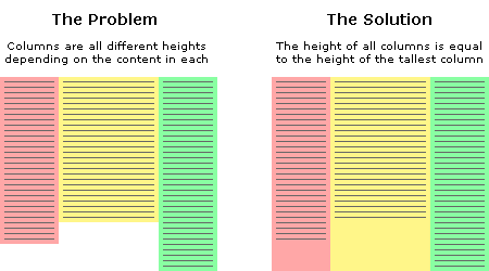
In the example above we have three columns each with a different amount of content. You will notice that the problem is the column background colours stretch only as far down as the height of the content they contain. This is the problem we are trying to solve. How can we make all columns the same height? Or more specifically, how can we make all columns the same height as the tallest column? This is a tricky thing to do because we will never know exactly how high each column will be or which one will be the longest. We can't simply give all columns an arbitrary height either as this will cause big spaces at the end of the page if there is only minimal content, and if there is too much content then the columns will end before the text does. Neither of these situations are desirable. The fact is, content length is dynamic so the heights of each column must also be dynamic. We must remember that nothing is 'fixed' on the web, people have different screen resolutions and the text in their browsers can be set to any size, all of these things can affect the height of content.
Separating the column content from it's background colour
The first step to solving the equal height problem is to break it into smaller pieces that can be solved separately. The way we do this is to use two divs for each column instead of one. The first div will be used to hold the content and the other will be used as the background colour. This separation gives us individual control over these elements plus we can put them together in a more useful way. This will all become clear shortly.
A floated container div will always be the height of it's floated contents
This is the central principle behind this equal column height method. The only way to make the height of a div equal to the tallest column is if that div contains all the columns. So to explain this another way, by placing the columns inside a container we cause the container to be the height of the tallest column. This is a very useful structure.
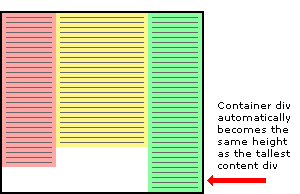
Three column HTML div structure
In the example above the three content columns are inside a container div.
<div id="container1">
    <div id="col1">Column 1</div>
    <div id="col2">Column 2</div>
    <div id="col3">Column 3</div>
</div>
Three column CSS
And here is the CSS that forces the container div to the height of the longest column.
#container1 {
    float:left;
    width:100%;
}
#col1 {
    float:left;
    width:30%;
    background:red;
}
#col2 {
    float:left;
    width:40%;
    background:yellow;
}
#col3 {
    float:left;
    width:30%;
    background:green;
}
For this structure to work correctly in all browsers the container div must be floated (left or right) plus each of the column content divs must also be floated, it does not matter which way. The process of floating the content divs makes them line up horizontally across the page. Floating the container makes it stretch down to the height of the tallest column inside. If we don't float the container then the content divs will stick out of the container at the bottom and the container won't have the correct height. Actually in this example the container will end up with a height of zero if it is not floated.
Adding extra nested containers
The next step to equal height columns is to add extra containers so they are nested inside each other. We need the same number of containers as we do columns - three. These three containers are going to be the backgrounds of each column. Notice that we have removed the background colours from the original columns and added them to the containers.
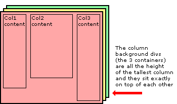
Three column HTML div structure
The two extra containers have been added to the HTML below.
<div id="container3">
    <div id="container2">
        <div id="container1">
            <div id="col1">Column 1</div>
            <div id="col2">Column 2</div>
            <div id="col3">Column 3</div>
        </div>
    </div>
</div>
Three column CSS
All the elements are floated to the left and the containers have a width set to 100% so they stay the full width of the page. The background colours have been removed from the content divs and added to the containers.
#container3 {
    float:left;
    width:100%;
    background:green;
}
#container2 {
    float:left;
    width:100%;
    background:yellow;
}
#container1 {
    float:left;
    width:100%;
    background:red;
}
#col1 {
    float:left;
    width:30%;
}
#col2 {
    float:left;
    width:40%;
}
#col3 {
    float:left;
    width:30%;
}
Moving the containers into place with relative positioning
Using relative positioning we now move the containers to their new locations. When each container is moved the divs become visible below. It is the layering and position of the coloured containers that create the background of the equal height columns. The container2 div is moved to the left by 30% to reveal the green right-hand column and the container1 div is moved to the left 40% to reveal the yellow center column and at the same time the red section that is still visible becomes the left-hand column.
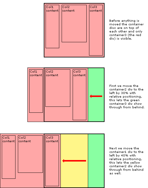
The CSS relative positioning rules
Here is the CSS showing the the addition of relative positioning.
#container3 {
    float:left;
    width:100%;
    background:green;
}
#container2 {
    float:left;
    width:100%;
    background:yellow;
    position:relative;
    right:30%;
}
#container1 {
    float:left;
    width:100%;
    background:red;
    position:relative;
    right:40%;
}
#col1 {
    float:left;
    width:30%;
}
#col2 {
    float:left;
    width:40%;
}
#col3 {
    float:left;
    width:30%;
}
Moving the content back into each column
The next thing to do is to move the content of each column back onto the page so that it aligns with the column background colour underneath. Again this is done with simple relative positioning.
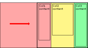
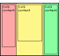
And then finally we chop off the overhanging containers by adding an overflow:hidden; rule on the outermost container - container3.
The CSS relative positioning rules
Here is the CSS showing the the addition of relative positioning and the overflow rule. Notice the extra position:relative; on container3, this is to solve an Internet Explorer bug that stops the overflow:hidden; from working.
#container3 {
    float:left;
    width:100%;
    background:green;
    overflow:hidden;
    position:relative;
}
#container2 {
    float:left;
    width:100%;
    background:yellow;
    position:relative;
    right:30%;
}
#container1 {
    float:left;
    width:100%;
    background:red;
    position:relative;
    right:40%;
}
#col1 {
    float:left;
    width:30%;
    position:relative;
    left:70%;
}
#col2 {
    float:left;
    width:40%;
    position:relative;
    left:70%;
}
#col3 {
    float:left;
    width:30%;
    position:relative;
    left:70%;
}
Adding padding to the columns
The last thing to do is add padding to the columns so the text is not squashed right up against the edge of each column. If we were to add a CSS padding rule to the columns this might work in some browsers but unfortunately not all. Internet Explorer get's the box model wrong and so it calculates the width of elements with padding differently. A box 200 pixels wide with 20 pixels padding will be a total of 200 pixels wide in Internet Explorer but in all other browsers it will be a correct 240 pixels wide. Padding, you see, should be 'added' to the width of an element, not taken away. CURSE MICROSOFT!
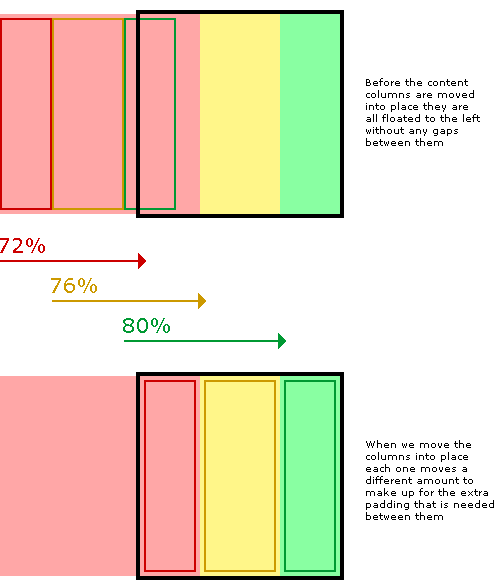
But don't worry... we can solve this problem in a completely different way that does not rely on a padding rule. Instead we just make our columns narrower (the column width minus padding on both sides) and then just move them into the correct position with relative positioning. In our example we will use 2% padding so a column that is 30% wide will be reduced to 26% and a 40% wide column is reduced to 36%. When we move the columns back into place with relative positioning we need to remember that the columns are now narrower so when they are initially all floated together to the left, each one has progressively further to move into place than the one before.
The completed CSS
To keep the layout together at small widths I have also added an overflow:hidden; rule to each content column. This will chop off any content that is too wide for the column and stop it interfering with the rest of the layout. Again, this is only really a problem with Internet explorer, all other browsers will maintain the correct layout no matter what is in the columns. If you really want to, try exposing this rule only to IE with IE conditional comments.
#container3 {
    float:left;
    width:100%;
    background:green;
    overflow:hidden;
    position:relative;
}
#container2 {
    float:left;
    width:100%;
    background:yellow;
    position:relative;
    right:30%;
}
#container1 {
    float:left;
    width:100%;
    background:red;
    position:relative;
    right:40%;
}
#col1 {
    float:left;
    width:26%;
    position:relative;
    left:72%;
    overflow:hidden;
}
#col2 {
    float:left;
    width:36%;
    position:relative;
    left:76%;
    overflow:hidden;
}
#col3 {
    float:left;
    width:26%;
    position:relative;
    left:80%;
    overflow:hidden;
}
Well, that's it. I hope you found this article useful. Have a play with the CSS and see how it works for yourself. You can have as many columns as you want as long as there are the same amount of containers as content columns.
Don't forget to check out my demo pages: 2 column, 3 column, 4 column and 5 column.
原文:http://matthewjamestaylor.com/blog/equal-height-columns-cross-browser-css-no-hacks
实例:
本文:跨浏览器实现等高栏 Equal Height Columns with Cross-Browser CSS


相关推荐
标题“equal-height-borders:Bootstrap列上的等高边框”指的是如何在Bootstrap的网格系统中实现列的等高边框,使每一列的边界在同一水平线上,即使内容量不同。 描述中提到的“可以使用两种不同的方法在引导程序列...
首先,让我们了解什么是等高布局(Equal Height Layout)。等高布局是指在网页上,当有多列内容并排放置时,即使各列内容长度不一致,也能保证这些列的可视区域高度相同。这样可以避免出现参差不齐的视觉效果,提升...
在上述代码中,`.equal-height-elements`是你要应用等高布局的元素类名。根据实际需要,你可以修改这个选择器以匹配不同的元素。 此外,CSS在实现等高布局中也扮演着关键角色。虽然jQuery插件可以处理动态的高度...
在某些情况下,尤其是旧版浏览器不支持CSS Flexbox或Grid时,可以使用JavaScript来动态计算元素的高度,实现等高布局。例如,jQuery插件如Equal Heights或纯JavaScript的解决方案,可以在页面加载或窗口调整大小时...
1. **CSS Flexbox**:在现代浏览器中,使用CSS Flexbox是最简便的实现等高布局的方法。通过设置容器的`display: flex`属性,并配合`align-items: stretch`,可以让子元素(图片)自动拉伸至与最长的子元素等高。 2....
适用于 node.js (8+) 和浏览器 (IE9+) 按值检查 Date 和 RegExp 对象的相等性。 ES6 equal ( require('fast-deep-equal/es6') ) 也支持: 地图 套 类型化数组 用法 var equal = require ( 'fast-deep-equal' ) ...
关于等高布局,有多种解决方案,如:Equal Height Columns(使用负margin和padding),Table Cell模拟法,Flexbox的`align-items: stretch`属性,以及Grid布局的`auto-fill`和`minmax()`函数。其中,Flexbox和Grid是...
<div class="equal-height-div one">内容1 <div class="equal-height-div two">内容2 ``` 在CSS中,我们可以为这些div设置基本样式,但初始情况下它们可能会有不同的高度,因为内容长度不一: ```css .equal-...
名称:Audio Mi- volume booster & equal ---------------------------------------- 版本:1.3.7 作者:Mi Audio 分类:网页增强 ---------------------------------------- 概述:Audio Mi 是一款易于使用的 ...
在IT行业中,图片展示等高(Equal Height Images)是一种常见的网页设计技巧,目的是在布局中保持多张图片的顶部对齐,使视觉效果更加整洁、统一。这种技术尤其适用于网格布局,例如产品展示、博客文章预览或者画廊...
本文将详细探讨如何利用jQuery实现表单验证,特别是`equalTo`方法的使用,这是一个非常实用的功能,用于确保用户输入的两个字段值相等,如常见于确认密码或验证码场景。 首先,理解`equalTo`方法的基本概念。`equal...
内部CSS也称为嵌入式CSS。 这基本上是HTML文档中CSS。 嵌入式css意味着您可以在html文件的头部内使用和指定css代码及其需要执行的操作。 因此,通常可以按照通常HTML文件设置方法完成所有操作,但是在头内部使用...
这里的'.equal-height-elements'是你想要进行等高排列的元素的CSS选择器。通过这种方式,所有具有该类名的元素都将自动调整其高度以保持一致。 matchHeight.js还提供了几个可选参数,以满足更复杂的需求。例如,你...
官方离线安装包,测试可用。使用rpm -ivh [rpm完整包名] 进行安装
官方离线安装包,测试可用。使用rpm -ivh [rpm完整包名] 进行安装
官方离线安装包,测试可用。使用rpm -ivh [rpm完整包名] 进行安装
如果你在项目中使用Bootstrap框架,可以利用它的`equal-height`类或者自定义CSS来实现三行等高。Bootstrap 4中,可以使用`row-eq-height`类,但在Bootstrap 5中,这个类已被移除,需要自定义CSS。 以上就是实现...
射频电路中等功率增益圆的绘画,本程序设置的增益为最大可能增益的90%,80 ,50%,利用等功率圆可分别设计匹配网络。
equal-pmb库可能是这样一种实现,它可能包含了一套全面的算法,能够递归地比较对象的所有属性,包括嵌套的对象和数组。 从提供的压缩包子文件名"equal-pmb-js-master"来看,这可能是一个JavaScript项目的主分支...