
Project : bootstrap-datetimepicker

Project forked
This project is a fork of bootstrap-datepicker project.
Home
As 'bootstrap-datetimepicker' is restricted to the date scope (day, month, year), this project aims to support too the time picking (hour, minutes).
Screenshots
Decade year view

This view allows to select the day in the selected month.
Year view

This view allows to select the month in the selected year.
Month view
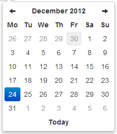
This view allows to select the year in a range of 10 years.
Day view

This view allows to select the hour in the selected day.
Hour view

This view allows to select the preset of minutes in the selected hour. The range of 5 minutes (by default) has been selected to restrict buttons quantity to an acceptable value, but it can be overrided by the minuteStepproperty.
Day view - meridian

Meridian is supported in both the day and hour views. To use it, just enable the showMeridian property.
Hour view - meridian

Example
Attached to a field with the format specified via options:
<input type="text" value="2012-05-15 21:05" id="datetimepicker">
$('#datetimepicker').datetimepicker({
    format: 'yyyy-mm-dd hh:ii'
});
Attached to a field with the format specified via markup:
<input type="text" value="2012-05-15 21:05" id="datetimepicker" data-date-format="yyyy-mm-dd hh:ii">
$('#datetimepicker').datetimepicker();
As component:
<div class="input-append date" id="datetimepicker" data-date="12-02-2012" data-date-format="dd-mm-yyyy">
    <input size="16" type="text" value="12-02-2012" readonly>
    <span class="add-on"><i class="icon-th"></i></span>
</div>
$('#datetimepicker').datetimepicker();
As inline datetimepicker:
<div id="datetimepicker"></div>
$('#datetimepicker').datetimepicker();
Using bootstrap-datetimepicker.js
Call the datetimepicker via javascript:
$('.datetimepicker').datetimepicker()
Dependencies
Requires bootstrap's dropdown component (dropdowns.less) for some styles, and bootstrap's sprites (sprites.less and associated images) for arrows.
A standalone .css file (including necessary dropdown styles and alternative, text-based arrows) can be generated by running build/build_standalone.less through the lessc compiler:
$ lessc build/build_standalone.less datetimepicker.css
Options
All options that take a "Date" can handle a Date object; a String formatted according to the given format; or a timedelta relative to today, eg '-1d', '+6m +1y', etc, where valid units are 'd' (day), 'w' (week), 'm' (month), and 'y' (year).
You can also specify an ISO-8601 valid datetime, despite of the given format :
- yyyy-mm-dd
- yyyy-mm-dd hh:ii
- yyyy-mm-ddThh:ii
- yyyy-mm-dd hh:ii:ss
- yyyy-mm-ddThh:ii:ssZ
format
String. Default: 'mm/dd/yyyy'
The date format, combination of p, P, h, hh, i, ii, s, ss, d, dd, m, mm, M, MM, yy, yyyy.
- p : meridian in lower case ('am' or 'pm') - according to locale file
- P : meridian in upper case ('AM' or 'PM') - according to locale file
- s : seconds without leading zeros
- ss : seconds, 2 digits with leading zeros
- i : minutes without leading zeros
- ii : minutes, 2 digits with leading zeros
- h : hour without leading zeros - 24-hour format
- hh : hour, 2 digits with leading zeros - 24-hour format
- H : hour without leading zeros - 12-hour format
- HH : hour, 2 digits with leading zeros - 12-hour format
- d : day of the month without leading zeros
- dd : day of the month, 2 digits with leading zeros
- m : numeric representation of month without leading zeros
- mm : numeric representation of the month, 2 digits with leading zeros
- M : short textual representation of a month, three letters
- MM : full textual representation of a month, such as January or March
- yy : two digit representation of a year
- yyyy : full numeric representation of a year, 4 digits
weekStart
Integer. Default: 0
Day of the week start. 0 (Sunday) to 6 (Saturday)
startDate
Date. Default: Beginning of time
The earliest date that may be selected; all earlier dates will be disabled.
endDate
Date. Default: End of time
The latest date that may be selected; all later dates will be disabled.
daysOfWeekDisabled
String, Array. Default: '', []
Days of the week that should be disabled. Values are 0 (Sunday) to 6 (Saturday). Multiple values should be comma-separated. Example: disable weekends: '0,6' or [0,6].
autoclose
Boolean. Default: false
Whether or not to close the datetimepicker immediately when a date is selected.
startView
Number, String. Default: 2, 'month'
The view that the datetimepicker should show when it is opened. Accepts values of :
- 0 or 'hour' for the hour view
- 1 or 'day' for the day view
- 2 or 'month' for month view (the default)
- 3 or 'year' for the 12-month overview
- 4 or 'decade' for the 10-year overview. Useful for date-of-birth datetimepickers.
minView
Number, String. Default: 0, 'hour'
The lowest view that the datetimepicker should show.
maxView
Number, String. Default: 4, 'decade'
The highest view that the datetimepicker should show.
todayBtn
Boolean, "linked". Default: false
If true or "linked", displays a "Today" button at the bottom of the datetimepicker to select the current date. If true, the "Today" button will only move the current date into view; if "linked", the current date will also be selected.
todayHighlight
Boolean. Default: false
If true, highlights the current date.
keyboardNavigation
Boolean. Default: true
Whether or not to allow date navigation by arrow keys.
language
String. Default: 'en'
The two-letter code of the language to use for month and day names. These will also be used as the input's value (and subsequently sent to the server in the case of form submissions). Currently ships with English ('en'), German ('de'), Brazilian ('br'), and Spanish ('es') translations, but others can be added (see I18N below). If an unknown language code is given, English will be used.
forceParse
Boolean. Default: true
Whether or not to force parsing of the input value when the picker is closed. That is, when an invalid date is left in the input field by the user, the picker will forcibly parse that value, and set the input's value to the new, valid date, conforming to the given format.
minuteStep
Number. Default: 5
The increment used to build the hour view. A button is created for each minuteStep minutes.
pickerReferer : deprecated
String. Default: 'default'
The referer element to place the picker for the component implementation. If you want to place the picker just under the input field, just specify input.
pickerPosition
String. Default: 'bottom-right' (supported values are: 'bottom-right', 'bottom-left', 'top-right', 'top-left')
This option allows to place the picker just under the input field for the component implementation instead of the default position which is at the bottom right of the button.
viewSelect
Number or String. Default: same as minView (supported values are: 'decade', 'year', 'month', 'day', 'hour')
With this option you can select the view from which the date will be selected. By default it's the last one, however you can choose the first one, so at each click the date will be updated.
showMeridian
Boolean. Default: false
This option will enable meridian views for day and hour views.
initialDate
Date or String. Default: new Date()
You can initialize the viewer with a date. By default it's now, so you can specify yesterday or today at midnight ...
onRender
This event is fired when a day is rendered inside the datepicker. Should return a string. Return 'disabled' to disable the day from being selected.
$('#date-end')
    .datetimepicker({
        onRender: function(date) {
            return ev.date.valueOf() < date-start-display.valueOf() ? ' disabled' : '';
        }
    });
Markup
Format as component.
<div class="input-append date" id="datetimepicker" data-date="12-02-2012" data-date-format="dd-mm-yyyy">
    <input class="span2" size="16" type="text" value="12-02-2012">
    <span class="add-on"><i class="icon-th"></i></span>
</div>
Format as component with reset button to clear the input field.
<div class="input-append date" id="datetimepicker" data-date="12-02-2012" data-date-format="dd-mm-yyyy">
    <input class="span2" size="16" type="text" value="12-02-2012">
    <span class="add-on"><i class="icon-remove"></i></span>
    <span class="add-on"><i class="icon-th"></i></span>
</div>
Methods
.datetimepicker(options)
Initializes an datetimepicker.
remove
Arguments: None
Remove the datetimepicker. Removes attached events, internal attached objects, and added HTML elements.
$('#datetimepicker').datetimepicker('remove');
show
Arguments: None
Show the datetimepicker.
$('#datetimepicker').datetimepicker('show');
hide
Arguments: None
Hide the datetimepicker.
$('#datetimepicker').datetimepicker('hide');
update
Arguments:
- currentDate (Date).
Update the datetimepicker with the specified date.
$('#datetimepicker').datetimepicker('update', new Date());
Omit currentDate to update the datetimepicker with the current input value.
$('#datetimepicker').datetimepicker('update');
setStartDate
Arguments:
- startDate (String)
Sets a new lower date limit on the datetimepicker.
$('#datetimepicker').datetimepicker('setStartDate', '2012-01-01');
Omit startDate (or provide an otherwise falsey value) to unset the limit.
$('#datetimepicker').datetimepicker('setStartDate');
$('#datetimepicker').datetimepicker('setStartDate', null);
setEndDate
Arguments:
- endDate (String)
Sets a new upper date limit on the datetimepicker.
$('#datetimepicker').datetimepicker('setEndDate', '2012-12-31');
Omit endDate (or provide an otherwise falsey value) to unset the limit.
$('#datetimepicker').datetimepicker('setEndDate');
$('#datetimepicker').datetimepicker('setEndDate', null);
setDaysOfWeekDisabled
Arguments:
- daysOfWeekDisabled (String|Array)
Sets the days of week that should be disabled.
$('#datetimepicker').datetimepicker('setDaysOfWeekDisabled', [0,6]);
Omit daysOfWeekDisabled (or provide an otherwise falsey value) to unset the disabled days.
$('#datetimepicker').datetimepicker('setDaysOfWeekDisabled');
$('#datetimepicker').datetimepicker('setDaysOfWeekDisabled', null);
Events
Datetimepicker class exposes a few events for manipulating the dates.
show
Fired when the date picker is displayed.
hide
Fired when the date picker is hidden.
changeDate
Fired when the date is changed.
$('#date-end')
    .datetimepicker()
    .on('changeDate', function(ev){
        if (ev.date.valueOf() < date-start-display.valueOf()){
            ....
        }
    });
changeYear
Fired when the view year is changed from decade view.
changeMonth
Fired when the view month is changed from year view.
outOfRange
Fired when you pick a date before the startDate or after the endDate or when you specify a date via the methodsetDate or setUTCDate..
Keyboard support
The datetimepicker includes some keyboard navigation:
up, down, left, right arrow keys
By themselves, left/right will move backward/forward one day, up/down will move back/forward one week.
With the shift key, up/left will move backward one month, down/right will move forward one month.
With the ctrl key, up/left will move backward one year, down/right will move forward oone year.
Shift+ctrl behaves the same as ctrl -- that is, it does not change both month and year simultaneously, only the year.
escape
The escape key can be used to hide and re-show the datetimepicker; this is necessary if the user wants to manually edit the value.
enter
When the picker is visible, enter will simply hide it. When the picker is not visible, enter will have normal effects -- submitting the current form, etc.
Mouse Wheel View Navigation
In order to make this plugin easier to set different part of date time, mouse wheel has been used to navigate through different views. Scroll up your mouse wheel to navigate to the decade year view. Scroll down will lead to the minute view.
Dependency
To enalbe this feature. jQuery Mouse Wheel Plugin must be included before using this feature.
Options
wheelViewModeNavigation
Boolean. Default: false
Whether or not to enable navigating through different view mode using mouse wheel.
wheelViewModeNavigationInverseDirection
Boolean. Default: false
Whether or not to reverse the direction of scrolling. Default is scroll up to the decade view.
wheelViewModeNavigationDelay
Integer. Default: 100
Time delays between the next respond to the wheel command, it controls the speed between switching in different views. Unit is in million seconds.
About viewSelect option
The recommended value for viewSelect option is 4 when this feature is enable. That means you can easily update any the value in every view. This option value is applied in the demo page.
Feature Demo
A simple Demo page is given to show it's simple idea.
I18N
The plugin supports i18n for the month and weekday names and the weekStart option. The default is English ('en'); other available translations are avilable in the js/locales/ directory, simply include your desired locale after the plugin. To add more languages, simply add a key to $.fn.datetimepicker.dates, before calling.datetimepicker(). Example:
$.fn.datetimepicker.dates['en'] = {
    days: ["Sunday", "Monday", "Tuesday", "Wednesday", "Thursday", "Friday", "Saturday", "Sunday"],
    daysShort: ["Sun", "Mon", "Tue", "Wed", "Thu", "Fri", "Sat", "Sun"],
    daysMin: ["Su", "Mo", "Tu", "We", "Th", "Fr", "Sa", "Su"],
    months: ["January", "February", "March", "April", "May", "June", "July", "August", "September", "October", "November", "December"],
    monthsShort: ["Jan", "Feb", "Mar", "Apr", "May", "Jun", "Jul", "Aug", "Sep", "Oct", "Nov", "Dec"],
    today: "Today"
};
You can override the default date format in the language configuration with format attribute. Example:
$.fn.datetimepicker.dates['pt-BR'] = {
    format: 'dd/mm/yyyy'
};
Right-to-left languages may also include rtl: true to make the calendar display appropriately.
If your browser (or those of your users) is displaying characters wrong, chances are the browser is loading the javascript file with a non-unicode encoding. Simply add charset="UTF-8" to your script tag:
<script type="text/javascript" src="bootstrap-datetimepicker.de.js" charset="UTF-8"></script>


相关推荐
bootstrap-daterangepicker 是基于 Twitter 的 Bootstrap 框架下的一个日期选择控件。 标签:bootstrap
Bootstrap时间控件是一种基于Twitter Bootstrap框架的用户界面组件,用于在网页上实现高效、美观的时间选择功能。Bootstrap作为最流行和广泛使用的前端开发框架之一,提供了丰富的预设样式、组件和JavaScript插件,...
Twitter Bootstrap 是一个非常流行的开源前端框架,用于快速构建响应式和移动优先的网站。这个压缩包 "twitter-bootstrap-v2.1.1-0-gc52368d.zip" 包含的是Twitter Bootstrap的2.1.1版本,这是一个在Git版本控制下...
综上所述,Bootstrap-Datetimepicker是一个强大且灵活的日期时间选择插件,通过引入压缩包中的js和css文件,能够快速地在Bootstrap项目中实现优雅的日期和时间选择功能。结合其丰富的配置选项和事件处理,开发者可以...
总的来说,Bootstrap的时间控件是构建现代Web应用时的一个强大工具,它简化了日期和时间选择器的实现,同时提供了高度的可定制性,确保了在不同浏览器和设备上的兼容性和一致的用户体验。通过学习和应用这个插件,...
Bootstrap-Datetimepicker是一款基于Bootstrap框架的时间选择插件,它提供了用户友好的界面,使得在Web应用中添加日期和时间选择功能变得极其简单。这个插件不仅支持日期选择,还支持时间选择,甚至可以同时选择日期...
**基于BootStrap简洁美观Cron表达式选择器JS插件**是一款优秀的前端开发工具,专为需要在用户界面中方便地输入或选择Cron表达式的项目设计。Cron表达式是一种广泛用于计划任务调度的语言,它允许设置精确的时间间隔...
**AngularJS与Bootstrap结合开发Web控件集合** 在Web应用开发中,AngularJS和Bootstrap是两个非常受欢迎的开源框架。AngularJS,一个由Google维护的JavaScript框架,专注于数据绑定和依赖注入,使得前端开发更加...
- **表单(Forms)**:可以轻松创建美观的表单,包括输入控件、选择器、复选框和单选按钮等。 - **导航条(Navbar)**:提供固定在顶部或底部的导航,可以包含品牌标识、导航链接、下拉菜单等。 - **模态框...
Bootstrap双向选择器是一种基于流行的前端框架Bootstrap开发的组件,它为用户提供了一种高效且美观的方式来在两个列表之间移动选项,通常用于数据过滤、属性选择或角色分配等场景。这个组件的特点在于其用户友好的...
在本示例中,我们关注的是`bootstrap-datetimepicker-0.0.11`这个版本,这是一款基于Bootstrap框架的日期时间选择插件。下面将详细介绍这个控件的使用和相关知识点。 首先,Bootstrap本身是一个流行的前端开发框架...
它是Bootstrap的一个扩展插件,提供了多种样式和配置选项,如日历视图、时间选择、多语言支持等。在ASP.NET MVC5项目中,日期控件可以与模型绑定相结合,用于输入或显示日期字段,提高表单的用户友好性。 **Web...
Bootstrap日期控件是一种基于Bootstrap框架的用户界面组件,用于在网页上添加日期选择功能。Bootstrap是Twitter推出的一个开源的用于前端开发的工具集,它包括CSS样式、JavaScript插件和HTML模板,旨在使网站设计...
在网页中,日期时间选择控件是常见的用户界面元素,能够方便用户输入日期和时间,提升用户体验。以下是对三款JavaScript实现的日期时间选择控件的详细解析: 1. **Bootstrap DateTimePicker** Bootstrap ...
Bootstrap时间控件是一种基于Bootstrap框架开发的用户界面组件,用于...以上就是关于“bootstrap时间控件”的主要知识点,通过学习和实践,开发者可以创建出美观、易用的日期时间选择功能,提升网站或应用的用户体验。
Bootstrap Datetimepicker是一款基于Twitter Bootstrap框架的日期和时间选择插件,它为网页应用提供了强大的日期和时间选择功能。这个库特别适合那些需要用户输入精确日期或时间的项目,例如预订系统、日程管理或者...
官方介绍:Bootstrap, from Twitter基于HTML,CSS,JAVASCRIPT的简洁灵活的流行前端框架及交互组件集 http://twitter.github.com/bootstrap/ http://wrongwaycn.github.com/bootstrap/docs/ 推荐2款我试用的...
Bootstrap时间控件是一款基于Bootstrap框架的插件,用于在网页上提供方便的日期和时间选择功能。Bootstrap,是由Twitter开发的开源前端框架,它提供了丰富的样式、组件和JavaScript插件,帮助开发者快速构建响应式、...